Standards and recommendations
From google translation
Inclusion of pictures or diagrams
When you insert a picture or diagram in a document, it should be into account certain considerations.
Adjust the size of the images that you want to show them. That is, to show an entry in the menu bar probably not be needed an image of 1400 px.
In general we will not use images larger than 800x600 pixels.
A very common practice in the making of the manuals is capture screens at high resolutions, eg 1200x1024 pixels, and then reduce them using manipulation images tools for their inclusion in the documentation. This practice does not should be never used. The resulting images haven't a acceptable quality and these texts could not read or are read with great difficulty. We will capture images to the size with which they are to be included in the documentation for avoid loss of quality in them, or limit cut the area of interest without altering the resolution of these.
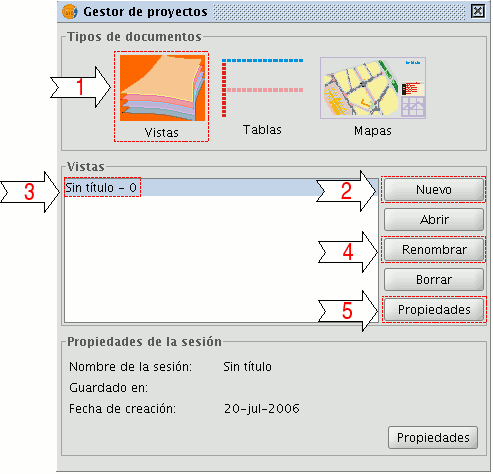
If the text is the reference to a button, window, dialogue, it must be clearly identified. This does not mean you need to take a screenshot individual of all the buttons, most of the time simply an image of the interface that is where you identify the elements of interest.
For example:

Project Management Composition window
- 1. Select document type "Views".
- 2. "New" button. Enables the creation of a new document.
- 3. Document titles "Views" created. By default, "Untitled - 0".
- 4. "Rename" button. Change the name of the "View" selected.
The color depth of the image must be in accordance with this, ie if an image contains little variety of color, use a depth of low color, and if you use a very high color depth, use a hight color palette. This usually reflected image using a color palette for those with little variety and color in RGB format for those with lots of variety.
In addition to using images with color palette, we try to have the number of palette colors as low as possible while maintaining good visual quality.
The format of the images to use go hand in hand with the color depth of this. For images with color palette use the PNG format, and images use in RGB JPEG format.
Other Recommendations
- We should not assume that users know things of the tool, is preferable to have much information that has not necessarily than missing information because it was considered something that is obvious.
- Never number the document titles. It is easy sometime insert or delete a document and we mismatch all numbering or even from another part of the web is made Reference to any member of our documents and the numbering established is not correct in the context in which the document falls.
- Never number the headings or sections within a document.
- Never use a manual to simulate bullets numbering numbered. If you need to use bullets numbered only use the ReStructuredText tools for it, even if we lose the possibility of nested bullets numbering (1.1.1, 1.1.2, 1.2.1 ,...).


