


Document Actions
Manual de usuario gvSIG 1.9
Manual usuario gvSIG-1.9 - Analisis y procesamiento de datos - Raster - Componentes generales - Control de tablas - Descripción
The table control component is used to represent data in tabular form and allows you to edit the data.
The possibilities are:
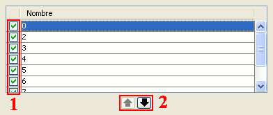
Table control components (1 and 2)
- Selection of rows in the table.
- Reordering the rows. Click on the arrow buttons to move a selected row up or down.
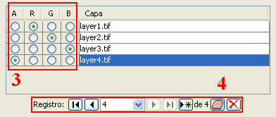
Table control components (3 and 4)
Choose a unique property for every row. In the example above, a band is allocated for each layer.
Typical table controls, as shown in the example at the bottom of the table. From left to right:
- Select the first row.
- Select the previous row.
- Drop down to select a particular row.
- Select the next row.
- Select the last row.
- Create a new row.
- Delete the selected row.
- Delete all rows from the table.
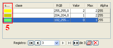
Table control components (5)
- In the table control, besides being able to edit anything if editing is enabled, you can also change the color by clicking on it.


